鸿蒙实战开发-使用常用组件与布局实现登录、首页、我的三个页面
58人参与 • 2024-08-01 • 华为
介绍
harmonyos arkui提供了丰富多样的ui组件,您可以使用这些组件轻松地编写出更加丰富、漂亮的界面。在本篇codelab中,您将通过一个简单的购物社交应用示例,学习如何使用常用的基础组件和容器组件。
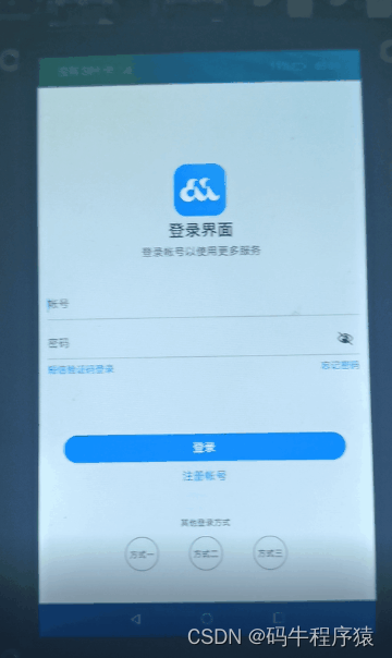
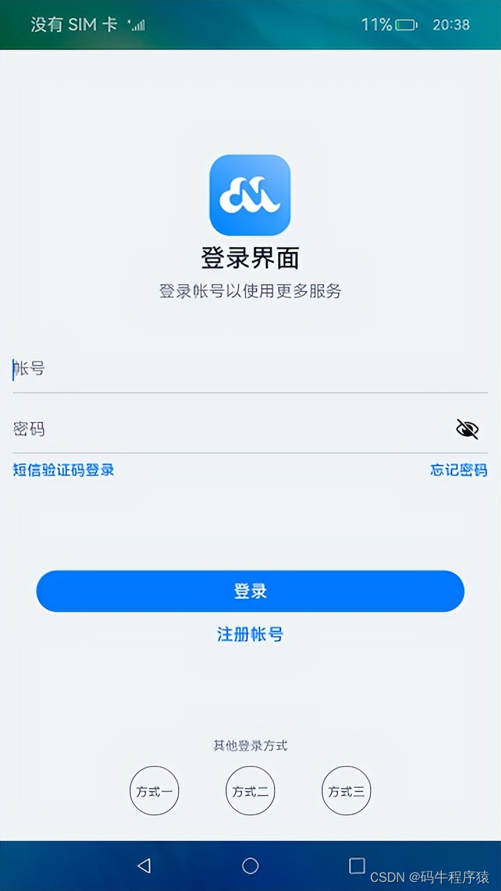
本示例主要包含:“登录”、“首页”、“我的”三个页面,效果图如下:
相关概念
- text:显示一段文本的组件。
- image:图片组件,支持本地图片和网络图片的渲染展示。
- textinput:可以输入单行文本并支持响应输入事件的组件。
- button:按钮组件,可快速创建不同样式的按钮。
- loadingprogress:用于显示加载动效的组件。
- flex:应用弹性方式布局子组件的容器组件。
- column:沿垂直方向布局的容器。
- row:沿水平方向布局容器。
- list:列表包含一系列相同宽度的列表项。适合连续、多行呈现同类数据,例如图片和文本。
- swiper:滑动容器,提供切换子组件显示的能力。
- grid:网格容器,由“行”和“列”分割的单元格所组成,通过指定“项目”所在的单元格做出各种各样的布局。
环境搭建
软件要求
- deveco studio版本:deveco studio 3.1 release。
- openharmony sdk版本:api version 9。
硬件要求
- 开发板类型:润和rk3568开发板。
- openharmony系统:3.2 release。
环境搭建
完成本篇codelab我们首先要完成开发环境的搭建,本示例以rk3568开发板为例,参照以下步骤进行:
- 获取openharmony系统版本:标准系统解决方案(二进制)。以3.2 release版本为例:
2.搭建烧录环境。
- 完成deveco device tool的安装
- 完成rk3568开发板的烧录
3.搭建开发环境。
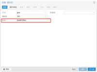
- 开始前请参考工具准备,完成deveco studio的安装和开发环境配置。
- 开发环境配置完成后,请参考使用工程向导创建工程(模板选择“empty ability”)。
- 工程创建完成后,选择使用真机进行调测。
代码结构解读
本篇codelab只对核心代码进行讲解。
├──entry/src/main/ets              // 代码区
│  ├──common
│  │  └──constants
│  │     └──commonconstants.ets    // 公共常量类
│  ├──entryability
│  │  └──entryability.ts           // 程序入口类
│  ├──pages
│  │  ├──loginpage.ets             // 登录界面
│  │  └──mainpage.ets	           // 主界面
│  ├──view
│  │  ├──home.ets                  // 首页
│  │  └──setting.ets               // 设置页
│  └──viewmodel
│     ├──itemdata.ets              // 列表数据实体类
│     └──mainviewmodel.ets         // 主界面视图model
└──entry/src/main/resources        // 应用资源目录
实现“登录”页面
本节主要介绍“登录”页面的实现,效果图如下:
界面使用column容器组件布局,由image、text、textinput、button、loadingprogress等基础组件构成,主要代码如下:
// loginpage.ets
@entry
@component
struct loginpage {
  ...
  build() {
    column() {
      image($r('app.media.logo'))
       ...
      text($r('app.string.login_page'))
        ...
      text($r('app.string.login_more'))
        ...

      textinput({ placeholder: $r('app.string.account') })
        ...

      textinput({ placeholder: $r('app.string.password') })
        ...

      row() {
        text($r('app.string.message_login')).bluetextstyle()
        text($r('app.string.forgot_password')).bluetextstyle()
      }
      ....

      button($r('app.string.login'), { type: buttontype.capsule })
        ....
      text($r('app.string.register_account'))
        ....

      if (this.isshowprogress) {
        loadingprogress()
          ....
      }

      blank()
      text($r('app.string.other_login_method'))
        ....
      row({ space: commonconstants.login_methods_space }) {
        this.imagebutton($r('app.media.login_method1'))
        this.imagebutton($r('app.media.login_method2'))
        this.imagebutton($r('app.media.login_method3'))
      }
    }
    ....
  }
}
获取用户输入
当用户登录前,需要获取用户输入的帐号和密码才能执行登录逻辑。给textinput设置onchange事件,在onchange事件里面实时获取用户输入的文本信息。
// loginpage.ets
textinput({ placeholder: $r('app.string.account') })
  .maxlength(commonconstants.input_account_length)
  .type(inputtype.number)
  .inputstyle()
  .onchange((value: string) => {
    this.account = value;
  })
控制loadingprogress显示和隐藏
给登录按钮绑定onclick事件,调用login方法模拟登录。定义变量isshowprogress结合条件渲染if用来控制loadingprogress的显示和隐藏。当用户点击按钮时设置isshowprogress为true,即显示loadingprogress;使用定时器settimeout设置isshowprogress 2秒后为false,即隐藏loadingprogress,然后执行跳转到首页的逻辑。
// loginpage.ets
@entry
@component
struct loginpage {
  @state account: string = '';
  @state password: string = '';
  @state isshowprogress: boolean = false;
  private timeoutid = null;

  ...

  login() {
    if (this.account === '' || this.password === '') {
      prompt.showtoast({
        message: $r('app.string.input_empty_tips')
      })
    } else {
      this.isshowprogress = true;
      if (this.timeoutid === null) {
        this.timeoutid = settimeout(() => {
          this.isshowprogress = false;
          this.timeoutid = null;
          router.replaceurl({ url: 'pages/mainpage' });
        }, commonconstants.login_delay_time);
      }
    }
  }

  ...

  build() {
    column() {
      ...

      button($r('app.string.login'), { type: buttontype.capsule })
        ....
        .onclick(() => {
          this.login();
        })
      ...

      if (this.isshowprogress) {
        loadingprogress()
          .color($r('app.color.loading_color'))
          .width($r('app.float.login_progress_size'))
          .height($r('app.float.login_progress_size'))
          .margin({ top: $r('app.float.login_progress_margin_top') })
      }

      ...
    }
    ...
  }
}
实现页面跳转
页面间的跳转可以使用router模块相关api来实现,使用前需要先导入该模块,然后使用router.replace()方法实现页面跳转。
// loginpage.ets
import router from '@ohos.router';

login() {
  if (this.account === '' || this.password === '') {
    ...
  } else {
    this.isshowprogress = true;
    if (this.timeoutid === -1) {
      this.timeoutid = settimeout(() => {
        this.isshowprogress = false;
        this.timeoutid = -1;
        router.replaceurl({ url: 'pages/mainpage' });
      }, commonconstants.login_delay_time);
    }
  }
}
实现“首页”和“我的”页面
定义资源数据
由于“首页”和“我的”页面中有多处图片和文字的组合,因此提取出itemdata类。在mainviewmodel.ets文件中对页面使用的资源进行定义,在mainviewmodel.ets文件中定义数据。
// itemdata.ets
export default class pageresource {
  title: resource;
  img?: resource;
  others?: resource;
  constructor(title: resource, img?: resource, others?: resource) {
    this.title = title;
    this.img = img;
    this.others = others;
  }
}

// mainviewmodel.ets
import itemdata from './temdata';
export class mainviewmodel {
  ...
  getfirstgriddata(): array<itemdata> {
    let firstgriddata: itemdata[] = [
      new itemdata($r('app.string.my_love'), $r('app.media.love')),
      new itemdata($r('app.string.history_record'), $r('app.media.record')),
      ...
    ];
    return firstgriddata;
  }
  ...
}
export default new mainviewmodel();
实现页面框架
从前面介绍章节的示意图可以看出,本示例由两个tab页组成,使用tabs组件来实现,提取tabbar的公共样式,同时设置tabcontent和tabs的backgroundcolor来实现底部tabbar栏背景色突出的效果。
// mainpage.ets
tabs({
  barposition: barposition.end,
  controller: this.tabscontroller
}) {
  tabcontent() {
    ...
  }
  ...
  .backgroundcolor($r('app.color.mainpage_backgroundcolor')) // “首页”的页面背景色
  .tabbar(this.tabbuilder(commonconstants.home_title, commonconstants.home_tab_index,
  $r('app.media.home_selected'), $r('app.media.home_normal')))
  ...
}
...
.backgroundcolor(color.white)  // 底部tabbar栏背景色
...
.onchange((index: number) => {
  this.currentindex = index;
})
...
实现“首页”内容
“首页”效果如下所示:

从上面效果如可以看出“首页”由三部分内容组成分别是轮播图、2*4栅格图、4*4栅格图。首先使用swiper组件实现轮播图,无需设置图片大小。
// home.ets
swiper(this.swipercontroller) {
  foreach(mainviewmodel.getswiperimages(), (img: resource) => {
    image(img).borderradius($r('app.float.home_swiper_borderradius'))
  }, (img: resource) => json.stringify(img.id))
}
...
.autoplay(true)
...
然后使用grid组件实现2*4栅格图,代码如下
// home.ets
grid() {
  foreach(mainviewmodel.getfirstgriddata(), (item: itemdata) => {
    griditem() {
      column() {
        image(item.img)
          .width($r('app.float.home_homecell_size'))
          .height($r('app.float.home_homecell_size'))
        text(item.title)
          .fontsize($r('app.float.little_text_size'))
          .margin({ top: $r('app.float.home_homecell_margin') })
      }
    }
  }, (item: itemdata) => json.stringify(item))
}
.columnstemplate('1fr 1fr 1fr 1fr')
.rowstemplate('1fr 1fr')
...
使用grid组件实现4*4栅格列表栏,其中单个栅格中有一张背景图片和两行字体不同的文本,因此在column组件中放置两个text组件,并设置背景图,注意grid组件必须设置高度,否则可能出现页面空白。
// home.ets
grid() {
  foreach(mainviewmodel.getsecondgriddata(), (seconditem: itemdata) => {
    griditem() {
      column() {
        text(seconditem.title)
          ...
        text(seconditem.others)
          ...
      }
      .alignitems(horizontalalign.start)
    }
    ...
    .backgroundimage(seconditem.img)
    .backgroundimagesize(imagesize.cover)
    ...
  }, (seconditem: itemdata) => json.stringify(seconditem))
}
...
.height($r('app.float.home_secondgrid_height'))
.columnstemplate('1fr 1fr')
.rowstemplate('1fr 1fr')
...
实现“我的”页内容
“我的”页面效果图如下:
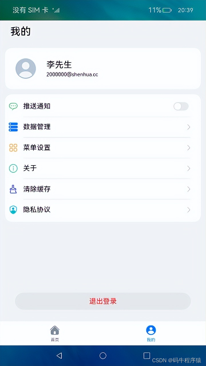
使用list组件结合foreach语句来实现页面列表内容,其中引用了settingcell子组件,列表间的灰色分割线可以使用divider属性实现,代码实现如下:
// setting.ets
list() {
  foreach(mainviewmodel.getsettinglistdata(), (item: itemdata) => {
    listitem() {
      this.settingcell(item)
    }
    .height($r('app.float.setting_list_height'))
  }, (item: itemdata) => json.stringify(item))
}
...
.divider({  // 设置分隔线
  ...
})
...

@builder settingcell(item: itemdata) {
  row() {
    row({ space: commonconstants.common_space }) {
      image(item.img)
        ...
      text(item.title)
        ...
    }
    if (item.others === null) {
      image($r("app.media.right_grey"))
        ...
    } else {
      toggle({ type: toggletype.switch, ison: false })
    }
  }
  .justifycontent(flexalign.spacebetween)  // 相邻元素之间距离相同
  ...
}
总结
目前你已经成功完成了codelab并且学到了:
- button、image、textinput、text等基础组件的使用。
- column、row、list、tabs等容器组件的使用。
为了帮助大家更深入有效的学习到鸿蒙开发知识点,小编特意给大家准备了一份全套最新版的harmonyos next学习资源,获取完整版方式请点击→《harmonyos教学视频》
harmonyos教学视频:语法arkts、typescript、arkui等…视频教程

鸿蒙生态应用开发白皮书v2.0pdf:
获取完整版白皮书方式请点击→《鸿蒙生态应用开发白皮书v2.0pdf》

鸿蒙 (harmony os)开发学习手册
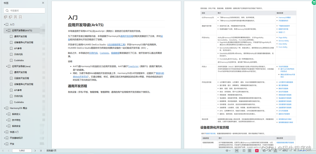
一、入门必看
- 应用开发导读(arkts)
- .……
二、harmonyos 概念
- 系统定义
- 技术架构
- 技术特性
- 系统安全
- …

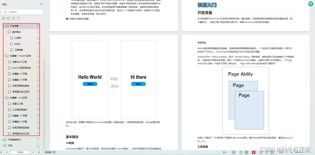
三、如何快速入门?《鸿蒙基础入门学习指南》
- 基本概念
- 构建第一个arkts应用
- .……
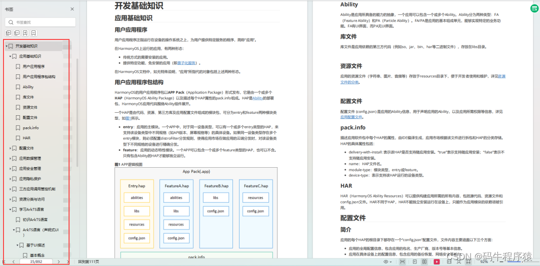
四、开发基础知识
- 应用基础知识
- 配置文件
- 应用数据管理
- 应用安全管理
- 应用隐私保护
- 三方应用调用管控机制
- 资源分类与访问
- 学习arkts语言
- .……
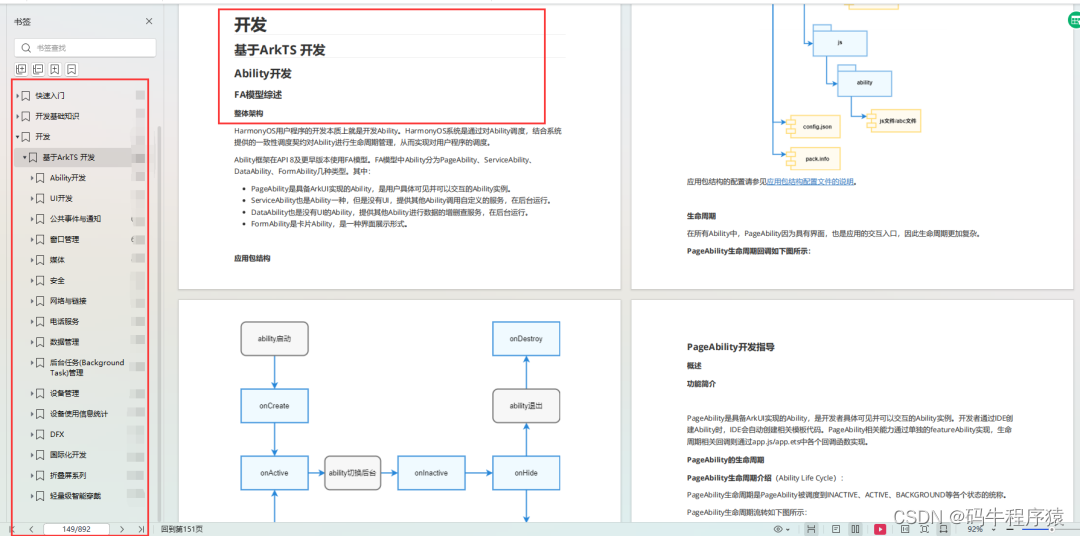
五、基于arkts 开发
- ability开发
- ui开发
- 公共事件与通知
- 窗口管理
- 媒体
- 安全
- 7.网络与链接
- 电话服务
- 数据管理
- 后台任务(background task)管理
- 设备管理
- 设备使用信息统计
- dfx
- 国际化开发
- 折叠屏系列
- .……
更多了解更多鸿蒙开发的相关知识可以参考:《鸿蒙 (harmony os)开发学习手册》
赞 (0)
您想发表意见!!点此发布评论


发表评论