css实现角标效果并带有文章或图标效果(完整代码)
337人参与 • 2025-06-19 • Css
代码示例:
.coupon_card.active {
border: 1px solid #f32121;
position: relative;
}
.coupon_card.active::after {
content: '';
position: absolute;
right: 0;
bottom: 0;
border-width: 0 0 20px 20px;
border-style: solid;
border-color: transparent transparent #f32121;
}
.coupon_card.active::before {
content: '';
position: absolute;
width: 10px;
height: 6px;
background: transparent;
bottom: 4px;
right: 2px;
border: 2px solid white;
border-top: none;
border-right: none;
-webkit-transform: rotate(-55deg);
-ms-transform: rotate(-55deg);
transform: rotate(-55deg);
z-index: 9;
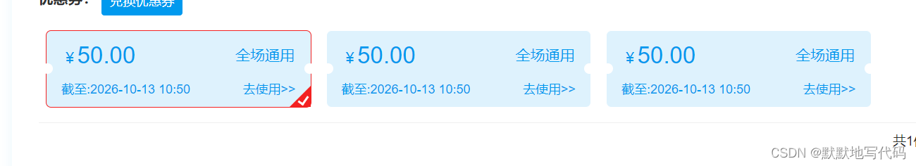
}效果图:
到此这篇关于css实现角标效果并带有文章或图标的文章就介绍到这了,更多相关css角标效果内容请搜索代码网以前的文章或继续浏览下面的相关文章,希望大家以后多多支持代码网!
赞 (0)
您想发表意见!!点此发布评论


发表评论