HarmonyOS Next 系列之底部标签栏TabBar实现(三)
369人参与 • 2024-08-02 • 正则表达式
系列文章目录
harmonyos next 系列之省市区弹窗选择器实现(一)
harmonyos next 系列之验证码输入组件实现(二)
harmonyos next 系列之底部标签栏tabbar实现(三)
前言
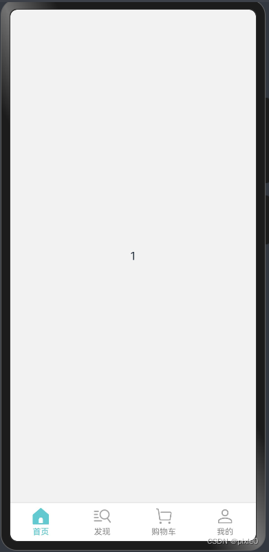
harmonyos next(基于api11)实现页面级容器——底部标签栏tabbar
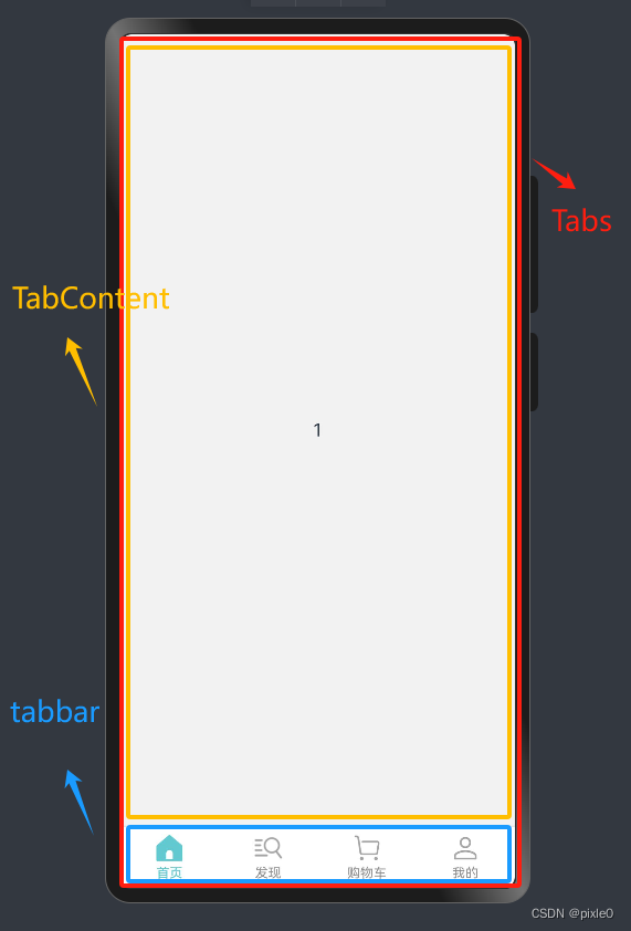
一、实现原理
tabs+tabcontent+自定义tabbar构建整个页面级tabbar容器,其中子组件tabcontent的tabbar属性支持传入自定义构建函数,通过自定义构建函数可以灵活布局整个底部标签样式,最后通过tabscontroller控制器实现页面切换
二、代码实现
1.自定义构建函数绘制单个标签样式
//tabbuilder自定义构建函数入参类型
interface builderparams {
index: number //标签索引
label: string //标签名称
normalicon: resource //未选中状态图标
selecticon: resource //选中状态图标
}
@entry
@component
struct tabbar{
controller: tabscontroller = new tabscontroller()//tabs控制器
@state current: number = 0//当前tab选中项的索引
@builder //每个tab标签样式布局
tabbuilder($$: builderparams) {
column() {
//图标
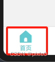
image(this.current === $$.index ? $$.selecticon : $$.normalicon).width(26)
//文字
text($$.label)
.fontsize('12fp')
.fontcolor(this.current === $$.index ? '#62c9d0' : '#909090')
.margin({ top: 3 })
}
.width('100%')
.onclick(()=>{
//点击切换页面
this.current=$$.index
this.controller.changeindex(this.current)//切换到当前页
})
}
说明:通过自定义构建函数tabbuilder绘制了单个标签块内容,垂直容器内添加一个图标和标题,入参包括当前标签索引、标题、激活状态下图标和未激活状态图标。通过入参索引和当前tabbar选中的位置current值判断是否处于选中状态,最后通过tabscontroller 控制器响应点击事件切换标签页
2.tabs构建整个tabbar页面级容器
build() {
column() {
tabs({ barposition: barposition.end, controller: this.controller }) {
tabcontent() {
text('1')//首页内容
}.tabbar(this.tabbuilder({
index: 0,//索引
label: '首页',//标签
normalicon: $r('app.media.tabbar11'),//未选中图标
selecticon: $r('app.media.tabbar12')//选中图标
}))
tabcontent() {
text('2')//发现页内容
}.tabbar(this.tabbuilder({
index: 1,
label: '发现',
normalicon: $r('app.media.tabbar21'),
selecticon: $r('app.media.tabbar22')
}))
tabcontent() {
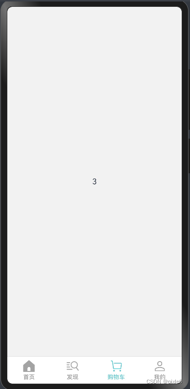
text('3')//购物车页内容
}.tabbar(this.tabbuilder({
index: 2,
label: '购物车',
normalicon: $r('app.media.tabbar31'),
selecticon: $r('app.media.tabbar32')
}))
tabcontent() {
text('4')//我的页内容
}.tabbar(this.tabbuilder({
index: 3,
label: '我的',
normalicon: $r('app.media.tabbar41'),
selecticon: $r('app.media.tabbar42')
}))
}
.width('100%')
.barmode(barmode.fixed)//平均分配barwidth宽度
.scrollable(true) //滑动页面切换tab
//与tabcontent分割线样式
.divider({
color: '#dedede',
strokewidth: 1
})
.barbackgroundcolor(color.white)
.onchange(((index:number)=>{
this.current=index
}))
}.width('100%')
.backgroundcolor('#f2f2f2')
}
说明:tabs内嵌4个tabcontent子组件分别对应标签页内容,tabcontent各自加载自定义构建函数绘制底部标签栏样式。示例中text(‘1’)//首页内容, text(‘2’)//发现页内容为标签页面显示内容,实际开发中可单独创建组件文件引入开发,方便维护。
完整代码
tabbar.ets
//tabitem自定义构建函数入参类型
interface builderparams {
  index: number //标签索引
  label: string //标签名称
  normalicon: resource //未选中状态图标
  selecticon: resource //选中状态图标
}

@entry
@component
struct tabbar {
  controller: tabscontroller = new tabscontroller()//tabs控制器
  @state current: number = 0//当前tab选中项的索引

  @builder //每个tabitem样式布局
  tabbuilder($$: builderparams) {
    column() {
      //图标
      image(this.current === $$.index ? $$.selecticon : $$.normalicon).width(26)
      //文字
      text($$.label)
        .fontsize('12fp')
        .fontcolor(this.current === $$.index ? '#62c9d0' : '#909090')
        .margin({ top: 3 })
    }
    .width('100%')
    .onclick(()=>{
       this.current=$$.index
       this.controller.changeindex(this.current)//切换到当前页
    })
  }

  build() {
    column() {
      tabs({ barposition: barposition.end, controller: this.controller }) {
        tabcontent() {
          text('1')//首页内容
        }.tabbar(this.tabbuilder({
          index: 0,//索引
          label: '首页',//标签
          normalicon: $r('app.media.tabbar11'),//未选中图标
          selecticon: $r('app.media.tabbar12')//选中图标
        }))

        tabcontent() {
          text('2')//发现页内容
        }.tabbar(this.tabbuilder({
          index: 1,
          label: '发现',
          normalicon: $r('app.media.tabbar21'),
          selecticon: $r('app.media.tabbar22')
        }))

        tabcontent() {
          text('3')//购物车页内容
        }.tabbar(this.tabbuilder({
          index: 2,
          label: '购物车',
          normalicon: $r('app.media.tabbar31'),
          selecticon: $r('app.media.tabbar32')
        }))

        tabcontent() {
          text('4')//我的页内容
        }.tabbar(this.tabbuilder({
          index: 3,
          label: '我的',
          normalicon: $r('app.media.tabbar41'),
          selecticon: $r('app.media.tabbar42')
        }))

      }
      .width('100%')
      .barmode(barmode.fixed)//平均分配barwidth宽度
      .scrollable(true) //滑动页面切换tab
      //与tabcontent分割线样式
      .divider({
        color: '#dedede',
        strokewidth: 1
      })
      .barbackgroundcolor(color.white)
      .onchange(((index:number)=>{
        this.current=index
      }))
    }.width('100%')
    .backgroundcolor('#f2f2f2')
  }
}
运行效果:
赞 (0)
您想发表意见!!点此发布评论


发表评论