前端练习小项目——方向感应名片
665人参与 • 2024-08-02 • 网页播放器
前言:在学习完html和css之后,我们就可以开始做一些小项目了,本篇文章所讲的小项目为——方向感应名片
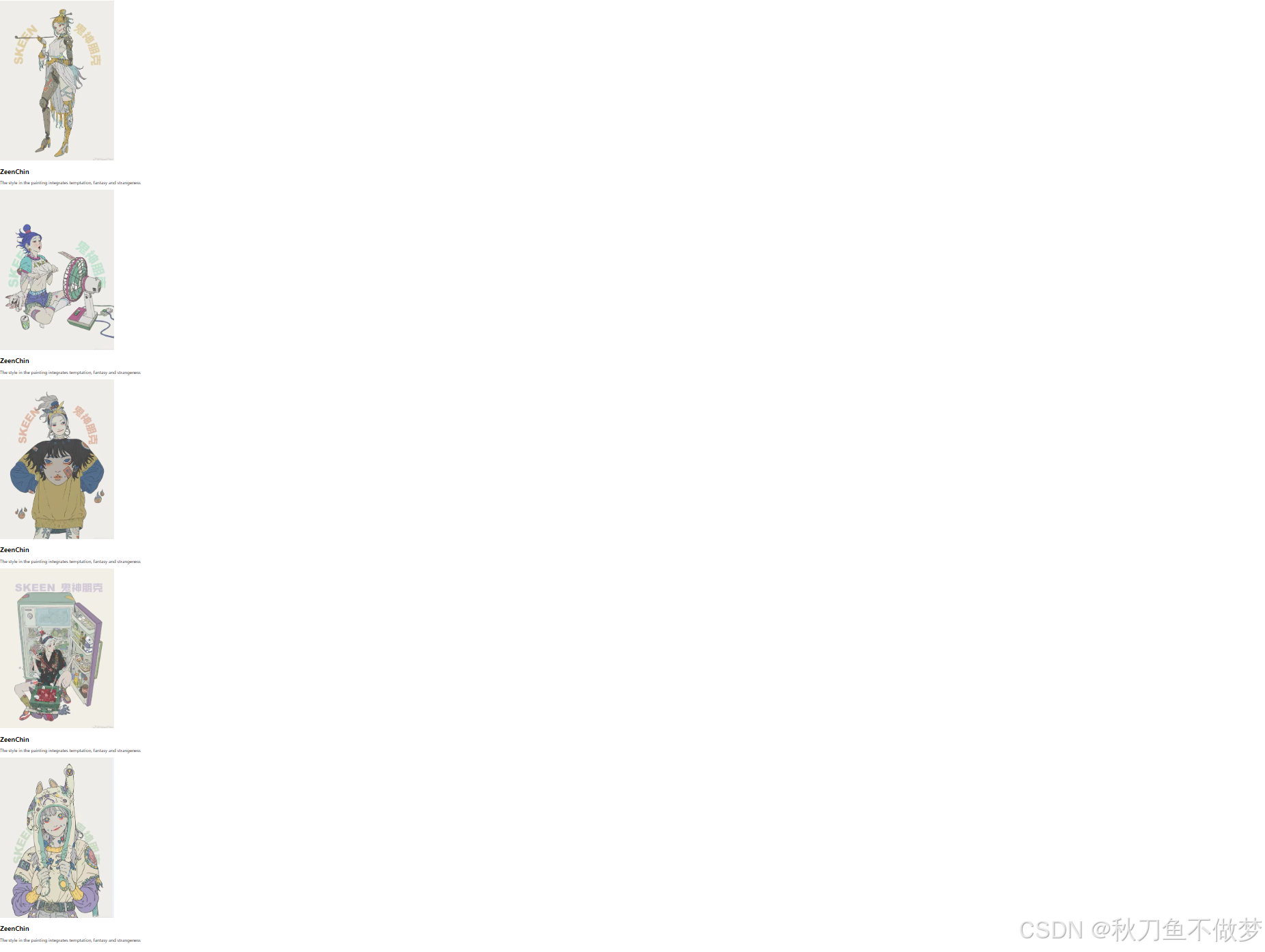
在开始学习之前,先让我们看一下最终效果:

那么我们如何去实现这样的小案例呢?在下文中我们对每一段重要的代码都进行了解释,读者可以根据注释对代码进行理解。
1.html代码
<!doctype html>
<html lang="en">

<head>
    <meta charset="utf-8">
    <meta http-equiv="x-ua-compatible" content="ie=edge">
    <meta name="viewport" content="width=device-width, initial-scale=1.0">
    <title>fish</title> <!-- 设置页面标题为fish -->
    <link rel="stylesheet" href="./test.css"> <!-- 引入外部css样式表 -->
</head>

<body>
    <div class="shell"> <!-- 外层容器 -->
        <div class="box"> <!-- 盒子容器 -->
            <div class="images"> <!-- 图片容器 -->
                <img src="./item1.jpg"> <!-- 显示item1.jpg图片 -->
            </div>
            <div class="content"> <!-- 内容容器 -->
                <h2>zeenchin</h2> <!-- 标题为zeenchin -->
                <p>the style in the painting integrates temptation, fantasy and strangeness
                </p> <!-- 段落内容描述绘画风格 -->
            </div>
        </div>
        <!-- 后续box结构与前面类似,每个box包含图片和内容 -->
        <div class="box">
            <div class="images">
                <img src="./item2.jpg">
            </div>
            <div class="content">
                <h2>zeenchin</h2>
                <p>the style in the painting integrates temptation, fantasy and strangeness
                </p>
            </div>
        </div>
        <div class="box">
            <div class="images">
                <img src="./item3.jpg">
            </div>
            <div class="content">
                <h2>zeenchin</h2>
                <p>the style in the painting integrates temptation, fantasy and strangeness
                </p>
            </div>
        </div>
        <div class="box">
            <div class="images">
                <img src="./item4.jpg">
            </div>
            <div class="content">
                <h2>zeenchin</h2>
                <p>the style in the painting integrates temptation, fantasy and strangeness
                </p>
            </div>
        </div>
        <div class="box">
            <div class="images">
                <img src="./item5.jpg">
            </div>
            <div class="content">
                <h2>zeenchin</h2>
                <p>the style in the painting integrates temptation, fantasy and strangeness
                </p>
            </div>
        </div>
    </div>

</body>

</html>
看完上述的代码之后,我相信读者已经有了大致的内容理解了,现在在让我们简单的回顾一下上述的代码:
——这里读者可以先对html中的代码进行简单的编写,这里直接展示html代码的结果了:
这样我们就大致的将网页的骨架搭建完成了,接下来在让我们编写css代码来进行对其的美化。
2.css代码
* {
    margin: 0;
    padding: 0;
}

body {
    /* 将内容区域居中显示 */
    display: flex;
    /* 使用 flex 布局 */
    justify-content: center;
    /* 水平居中 */
    align-items: center;
    /* 垂直居中 */
    min-height: 100vh;
    /* 最小高度占据整个视口 */
    /* 设置背景渐变色 */
    background-image: linear-gradient(to top, #fbc2eb 0%, #a6c1ee 100%);
}

.shell {
    /* 设置相对定位,启用3d变换 */
    position: relative;
    min-width: 1000px;
    /* 最小宽度为1000像素 */
    display: flex;
    /* 使用 flex 布局 */
    justify-content: center;
    /* 水平居中 */
    flex-wrap: wrap;
    /* 换行排列子元素 */
    transform-style: preserve-3d;
    /* 保持3d变换 */
    perspective: 900px;
    /* 设置透视效果 */
}

.shell .box {
    /* 设置相对定位和固定宽高 */
    position: relative;
    width: 250px;
    /* 宽度250像素 */
    height: 350px;
    /* 高度350像素 */
    transition: 0.6s;
    /* 过渡效果时长 */
    overflow: hidden;
    /* 隐藏溢出部分 */
    margin: 30px;
    /* 外边距为30像素 */
    transform: rotatey(0deg);
    /* 默认y轴旋转角度为0度 */
    transition-delay: .1s;
    /* 过渡延迟0.1秒 */
    border-radius: 5px;
    /* 设置圆角为5像素 */
    border: #fff 5px solid;
    /* 边框为白色5像素实线 */
}

/* 鼠标悬停在 .shell 上时 */
.shell:hover .box {
    transform: rotatey(20deg);
    /* 所有 .box 元素绕y轴旋转20度 */
}

/* 鼠标悬停在 .box 上时 */
.shell .box:hover {
    transform: rotatey(0deg) scale(1.25);
    /* 当前 .box 元素恢复到0度旋转并放大到1.25倍 */
    box-shadow: 0 25px 40px rgba(0, 0, 0, 0.7);
    /* 添加阴影效果 */
    z-index: 1;
    /* 设置堆叠顺序为1,使其位于最顶层 */
}

/* 鼠标悬停在 .box 上时,其他 .box 元素的效果 */
.shell .box:hover~.box {
    transform: rotatey(-20deg);
    /* 其他 .box 元素绕y轴反向旋转20度 */
}

.shell .box .images img {
    width: 100%;
    /* 图片宽度100% */
}

.shell .box .content {
    position: absolute;
    /* 绝对定位 */
    top: 0;
    /* 顶部与父元素对齐 */
    width: 90%;
    /* 宽度90% */
    height: 100%;
    /* 高度100% */
    z-index: 999;
    /* 设置堆叠顺序为999,使内容层位于最顶层 */
    padding: 15px;
    /* 内边距为15像素 */
}

.shell .box .content h2 {
    color: rgb(210, 140, 140);
    /* 设置标题颜色 */
    transition: 0.6s;
    /* 过渡效果时长 */
    font-size: 20px;
    /* 字体大小20像素 */
    transform: translatey(-100px);
    /* 初始位置向上偏移100像素 */
}

/* 鼠标悬停在 .box 上时的标题效果 */
.shell .box:hover .content h2 {
    transform: translatey(-15px);
    /* 标题向上偏移15像素 */
}

.shell .box .content p {
    color: rgb(0, 0, 0);
    /* 设置段落文本颜色 */
    transition: 0.6s;
    /* 过渡效果时长 */
    font-size: 14px;
    /* 字体大小14像素 */
    transform: translatey(600px);
    /* 初始位置向下偏移600像素 */
    background-color: rgba(255, 255, 255, 0.7);
    /* 设置背景颜色及透明度 */
}

/* 鼠标悬停在 .box 上时的段落效果 */
.shell .box:hover .content p {
    transform: translatey(220px);
    /* 段落向下偏移220像素 */
}
注:上边的代码中我们将每一行代码的讲解都附在了代码的上边,希望读者可以跟随着代码中的注释来理解每行代码的用意。
这里我们在简单的进行解释一下:
——最终我们将代码运行尽可以得到最终结果啦!(如图)
以上就是本篇文章的全部内容了~~~
赞 (0)
您想发表意见!!点此发布评论


发表评论