前端实现文本溢出展开和收起功能
313人参与 • 2025-04-24 • Javascript
判断文本溢出
众所周知,单行文本溢出打点仅需要:
.ellipsis {
  overflow: hidden;
  text-overflow: ellipsis;
  white-space: nowrap;
}
而单行文本判断是否溢出的关键就是element.scrollwidth > element.clientwidth
需要注意的是,当使用以上方式判断的时候,不要给元素加上overflow: hidden的样式,不然获取的clientwidth一直都是等于scrollwidth。
示例
先看下元素结构:
<div class="wrapper">
  <div class="text">
    lorem ipsum dolor sit amet consectetur adipisicing elit. nulla facere
    obcaecati consequatur quisquam adipisci veritatis! deserunt nostrum
    doloribus minima voluptatum labore.
    <span class="more">展开</span>
    <span class="collapse">收起</span>
  </div>
</div>文本在.text的元素中,里面有展开、收起两个按钮
再写点样式:
.wrapper {
  width: fit-content;
  height: fit-content;
  border-radius: 8px;
  border: 1px solid #00bfbf;
  padding: 8px;
}

.text {
  width: 300px;
  font-size: 14px;
  line-height: 20px;
}
于是就得到如下图所示的展示效果:
初始化将展开/收起按钮隐藏
/* 展开/收起按钮初始隐藏 */
.text .more {
  display: none;
}
.text .collapse {
  display: none;
}
要使用scrollwidth去判断文本是否溢出,关键需要给.text添加white-space: nowrap;
当需要给.text元素添加单行文本溢出的3行代码,不要直接添加到.text类名下(直接写overflow: hidden就不能使用scrollwidth判断文本溢出了)
另加一个类名,比如:.ellipsis,然后使用js判断文本是否溢出,再给该元素添加该类名。
.text.ellipsis {
  overflow: hidden;
  text-overflow: ellipsis;
  white-space: nowrap;
}让.more按钮仅在.ellipsis下展示,再给.more按钮写点样式,css代码如下:
/* 溢出 */
.text.ellipsis {
overflow: hidden;
text-overflow: ellipsis;
white-space: nowrap;
position: relative;
}
/* 文字溢出 - 展开按钮 */
.text.ellipsis .more {
display: block;
}
.more {
position: absolute;
right: 0;
top: 50%;
transform: translatey(-50%);
display: block;
color: #00bfbf;
background-color: #fff;
font-size: 14px;
line-height: 20px;
width: fit-content;
cursor: pointer;
}
.more::after {
content: "";
display: block;
position: absolute;
height: 20px;
width: 60px;
right: 28px;
top: 0;
background: linear-gradient(
to right,
rgba(255, 255, 255, 0),
rgba(255, 255, 255, 0.6),
rgba(255, 255, 255, 1)
);
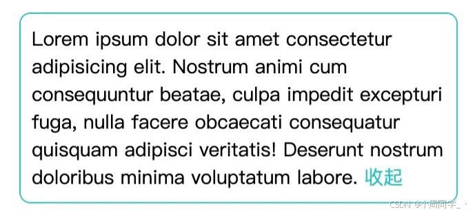
}就得到以下效果:

js判断文本溢出如下:
const istextoverflowx = (elem) => {
  return text.clientwidth < text.scrollwidth;
};

const text = document.getelementsbyclassname("text")[0];

const istextoverflow = istextoverflowx(text);

if (istextoverflow) {
  text.classlist.add("ellipsis");
}判断文本溢出后,才会给文字添加overflow: hidden,为了避免页面文字闪烁,给初始文本元素添加opacity: 0,在判断完毕后,设置opacity: 1
修改一下css,js代码
.text {
  ...
  white-space: nowrap;
  opacity: 0;
}

/* 未溢出 */
.text.normal {
  white-space: unset; // 让文字正常换行
  opacity: 1;
}
/* 溢出 */
.text.ellipsis {
  ...
  opacity: 1;
}
if (istextoverflow) {
text.classlist.add("ellipsis");
} else {
text.classlist.add("normal");
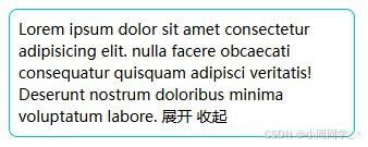
}分别给展开、收起按钮添加点击事件,事件仅需要添加、删除类名即可
const more = document.getelementsbyclassname("more")[0];
more.addeventlistener("click", () => {
text.classlist.remove("ellipsis");
text.classlist.add("expand");
});
const collapse = document.getelementsbyclassname("collapse")[0];
collapse.addeventlistener("click", () => {
text.classlist.remove("expand");
text.classlist.add("ellipsis");
});这里又加了个新类名.expand为了控制文本展开后的按钮显示隐藏
/* 文本展开 */
.text.expand {
white-space: unset;
opacity: 1;
}
/* 文本展开 - 收起按钮 */
.text.expand .collapse {
display: inline-block;
}最终效果如下:
完整代码
html:
<!doctype html>
<html lang="en">
<head>
<meta charset="utf-8" />
<meta name="viewport" content="width=device-width, initial-scale=1.0" />
<title>文字溢出隐藏</title>
<link rel="stylesheet" href="./index.css" rel="external nofollow" />
<script src="./index.js" defer></script>
</head>
<body>
<div class="wrapper">
<div class="text">
lorem ipsum dolor sit amet consectetur adipisicing elit. nostrum animi
cum consequuntur beatae, culpa impedit excepturi fuga, nulla facere
obcaecati consequatur quisquam adipisci veritatis! deserunt nostrum
doloribus minima voluptatum labore.
<span class="more">展开</span>
<span class="collapse">收起</span>
</div>
</div>
</body>
</html>css:
.wrapper {
width: fit-content;
height: fit-content;
border-radius: 8px;
border: 1px solid #00bfbf;
padding: 8px;
margin: 30px auto;
}
.text {
width: 300px;
font-size: 14px;
line-height: 20px;
white-space: nowrap;
opacity: 0;
}
/* 展开/收起按钮初始隐藏 */
.text .more {
display: none;
}
.text .collapse {
display: none;
}
/* 未溢出 */
.text.normal {
white-space: unset;
opacity: 1;
}
/* 溢出 */
.text.ellipsis {
overflow: hidden;
text-overflow: ellipsis;
white-space: nowrap;
position: relative;
opacity: 1;
}
/* 文字溢出 - 展开按钮 */
.text.ellipsis .more {
display: block;
}
/* 文本展开 */
.text.expand {
white-space: unset;
opacity: 1;
}
/* 文本展开 - 收起按钮 */
.text.expand .collapse {
display: inline-block;
}
.more {
position: absolute;
right: 0;
top: 50%;
transform: translatey(-50%);
display: block;
color: #00bfbf;
background-color: #fff;
font-size: 14px;
line-height: 20px;
width: fit-content;
cursor: pointer;
}
.more::after {
content: "";
display: block;
position: absolute;
height: 20px;
width: 60px;
right: 28px;
top: 0;
background: linear-gradient(
to right,
rgba(255, 255, 255, 0),
rgba(255, 255, 255, 0.6),
rgba(255, 255, 255, 1)
);
}
.collapse {
color: #00bfbf;
cursor: pointer;
}js:
const istextoverflowx = (elem) => {
return text.clientwidth < text.scrollwidth;
};
const text = document.getelementsbyclassname("text")[0];
const istextoverflow = istextoverflowx(text);
if (istextoverflow) {
  text.classlist.add("ellipsis");
} else {
  text.classlist.add("normal");
}
const more = document.getelementsbyclassname("more")[0];
more.addeventlistener("click", () => {
  text.classlist.remove("ellipsis");
  text.classlist.add("expand");
});

const collapse = document.getelementsbyclassname("collapse")[0];
collapse.addeventlistener("click", () => {
  text.classlist.remove("expand");
  text.classlist.add("ellipsis");
});
拓展
多行文本溢出
多行文本展开收起的思路一样的
需要修改下文本溢出判断函数,使用clientheight、scrollheight判断:
const istextoverflowy = (elem) => {
  return text.clientheight < text.scrollheight;
};.ellipsis溢出css修改为多行文本溢出打点即可
.ellipsis {
    overflow : hidden;
    text-overflow: ellipsis;
    display: -webkit-box;
    -webkit-line-clamp: 2;
    -webkit-box-orient: vertical;
}
以上就是前端实现文本溢出展开和收起功能的详细内容,更多关于前端文本溢出展开收起的资料请关注代码网其它相关文章!
赞 (0)
您想发表意见!!点此发布评论


发表评论